Showing posts with label remodel. Show all posts

Friday, November 7, 2014

New chairs for the kitchen...


I'll let you into a secret, I have a bit of a thing for chairs. I have been secretly collecting them for years. Wooden ones, plastic ones, leather ones. I'm so good at it, that I don't think Jim has actually noticed our expanding collection. 

But the thing about chairs is that they have to be practical as well as beautiful. We bought our old kitchen chairs four years ago, before we lived in this house and before parenthood. They looked great, but had a rotating base and a design which meant you could only sit on them with a cushion.

Whilst they were fine for the two of us, as Theo grew and the average age of the people we were seating got younger, we discovered children literally cannot sit still on them and the textured fabric cushions seemed to have a magnetic pull for any stray food. Grubby spinny chairs, not good.

But what to replace them with? We needed something child friendly, but modern. I've always been a fan of mid-century designs, particularly Eames (we already have the lounge chair) so it seemed logical to consider DSW Chairs.


DSWs have been on my wish list for a while, I even had a picture of one of the original 50s chairs on one of my boards on Pinterest (it's funny how when you pin stuff it seems to register subliminally in the brain!) but I was worried that after buying one set of trendy but ultimately impractical chairs, the DSWs might not be right for us.

Whilst I was still dithering about how and when to replace our chairs, MDM Furniture came to our rescue offering us two chairs for review. They specialise in producing replica designer chairs, among which is the DSW.

The chairs arrived with lightning speed and were easy to assemble. After a couple of weeks in our kitchen we are converts. I'm a taken by the sexy steel and wood legs and the plastic tops have given us the kind of practical wipe-clean finish we wanted. There's only one problem now, which is that we need four more. 


So the question is, do we buy them all white, or mix the colours up a bit?

Follow on Bloglovin

Tuesday, October 28, 2014

Inside my She-Shed


There can't be a woman anywhere who doesn't fancy the idea of a She-Shed. A little place to escape from the whir of the washing machine and the unrelenting calls of "Mummy!"

Well mine is finally starting to take shape! Over the last few weeks as I've caught up on sewing projects, I've also begun to sort out the cabin in the garden, transforming it from it's first life as a sleeping space during our building works, into it's new role as my studio. 

There's still a long way to go before it looks anything like the pictures of perfect sewing rooms that you see in magazines. (I probably need to iron all my fat quarters and stack them perfectly just to begin with) but already it's a place I love to retreat to if I can steal a couple of hours while Theo is at nursery.

Part of its beauty is that because it's detached from the house, none of the day to day house clutter invades my sewing space and likewise my sewing doesn't take over the living space.


At the moment it is being used solely for quilting, but longterm I also want to have a photography backdrop on one wall which can be rolled up and down when needed. The cabin faces south and the light in it is lovely, even at this time of the year.

Many of the things inside are bits I had acquired over the years which have traveled through a few countries to get here, but I also bought a few bits just for this space.

The pine table my sewing machine is on came from eBay. It was very cheap because it was far too low for practical use. We raised it up by several inches to make it useable again and when I have actually got round to painting the feet, I'll explain the whole process we did.  It was actually very easy and salvaged an otherwise lovely but unusable table.


This magnetic noticeboard came from Canada and is called an Everyday Display. It is supposed to be used for scrapbook pages (oh yes, I used to be a scrapbooker!) but has lots of photos and magnets on it at the moment. The smaller magnets are from Picstick who are currently doing a 25% off deal for readers of this blog if you use the code 'MAYB25' until November 5th.


My sister (the antiques hunter!) bought me the Dr Pepper tray last Christmas. The various quilts on the walls are either made by me or by other lovely quilters as part of swaps on Flickr. The one in the photo above was made by Liz.


This sweetheart display cabinet was given to me by the dotcomgiftshop and is brilliant for storing precious bits and pieces that Theo is not supposed to get his hands on.

Amongst the things on the shelves are a collection of champagne corks marking various significant points in our lives (from four countries) a very old toy truck marked up as British Forces Broadcasting (my former employers) the "&" sign from the table plan at our wedding (The C and J have vanished!) and a pin cushion made for me as part of a swap.

If you could have a She-Shed what would use it for? Many of these outside buildings have been turned into artist studios or libraries.One person even has an extra large one with a swimming pool in it!


Follow on Bloglovin

Thursday, October 2, 2014

At last, a plan for our bedroom...


Last weekend we finally started the journey of transforming our bedroom from bland to errrr... boudoir?

If you've been reading this blog for a while you may be aware that amongst the confusion and chaos of settling back into our newly extended house, our own bedroom got a little forgotten. I had very clear design ideas about some rooms in the house, but just not that room.

Then two things happened. Firstly our old Ikea Malm bed died. I bought it in Germany seven years ago and since then we calculated that it has been taken apart and put back together nine times, oh and shipped across the Atlantic twice. So it's no wonder it fell apart.

We replaced it with a bed from Feather & Black who happen to have a huge clearance outlet just up the road (yay!) and at the same time I happened to stumble across this lovely house which has virtually the same bed, the same round window and a beautiful neutral colour scheme and a plan began to evolve.


So here's what's going to happen....

This week I have purchased the foam we will need for the window seat and the cushion for the round window and I have bought 12 metres of fabric from Falcon Fabrics to do the curtains and the window seat.

Inspired by this post on Love Chic Living, I think I have narrowed down the kind of rug we want for the bedroom. Something wool, neutral and geometric.

Our walk-in wardrobe needs kitting out with some proper fitted units to finally make the space tidy. (I've been seeking inspiration from urbanwardrobes.co.uk.)

We are going to create a wall of white picture frames between the wardrobe and the en-suite like this.

The bedroom furniture (a chest of drawers and two bedside tables) which were bought very cheaply, need replacing with something a bit more inspiring and in keep with the overall design.

And finally we need acccessories to liven up the big white space. I'm building a Pinterest board of ideas ready for my next trip to Ardingly in November.

So, now I've committed that to a blog post there is no escaping. I'm going to try and stop getting distracted by trying to decorate every room of the house simultaneously and focus on this one room. First task is the curtains and cushions, I'll update you as I progress...

Follow on Bloglovin

Monday, September 29, 2014

En-suite bathroom tour


A few weeks ago I gave you a tour of our main family bathroom and now it's the turn of our en-suite

This bathroom is quite different from the other one. We spent nearly twice as much on fixtures and fittings and we opted for a simple modern look.

We chose a modern free standing bath and an opening (as opposed to sliding or bi-fold) glass shower door with a dual head system giving he option of rainfall or (for non hair washing days!) a regular shower head.

One of the biggest decisions was about tiling the shower. We originally planned to use glass tiles (which are uber expensive) but found these ceramic ones in a similar shade at Topps Tiles for a fraction of the price. The rest of the bathroom then fitted around the teal and white colour scheme

One of our indulgences was to have a heated LED shaving mirror which turns on and off by passing your hand underneath it. We also have underfloor heating (tested, but yet to be used) which amazingly we won in a facebook competition!

The bathroom still isn't really finished. We need a blind for the window and a few extra bits to make it a little more interesting. Although I intended it to be more of a grown ups bathroom, it's rather put in the shade by it's brighter cousin across the landing.

Suppliers...

Tiles -  Topps Tiles
Underfloor heating - Fit My Wood Floor
Mosaic frame - moo.com
Bin - BHS
Basin mixer tap - similar available from clickbasin.co.uk
Bath mat - John Lewis
Mirror - illuminatedmirrors.co.uk


Follow on Bloglovin

Wednesday, September 17, 2014

5 remodel overspends that paid off...


Last week I was interviewed by a journalist for an article that Self Build & Design magazine are going to be running on our house remodel. We had originally said no to the feature, because unless you have a business you want to promote there is no real benefit to the homeowner. However after a little negotiation, they agreed to pay a fee for using some of my photos and so we decided to go ahead.

One of the questions they asked me was about the areas where we'd splurged a bit and although we did very little splurging as such, we definitely overspent in certain areas of the budget and didn't regret it. There are so many decisions to make on a project like this that I think it's useful just to note down our successful overspends for the benefit of others who may be doing similar builds.

Wooden Floor

Our wooden floors could easily have been a disaster. We bought our first wooden floor from a large national store. It was under budget so we thought we were being clever, but as soon as we got it home I realised we'd made a big mistake. We returned it and then spent a bit more to get what we really wanted. Some corners aren't worth cutting, particularly if you have to look at them every day and wish you'd just spent the extra £200.

Skylights

Our Velux windows turned out to be one of our best purchases. I originally priced up a cheaper alternative window, but after a lot of debate we decided to pay the extra for a known brand, largely because you can retro-fit electric blinds to them. It paid off almost immediately as we made as we had to change the size of one of the windows we'd ordered and Velux collected the old one and dispatched the new at no additional cost and with very little hassle. 


Cabin

There was nothing at all in our original budget to replace the rundown garden building we had. We considered hiring a caravan, but access problems ruled that out. In the end buying the cabin not only enabled us to live on site (and escape to a dry, warm, dust free space) but also gave me a brilliant sewing room at the end.

Balcony

Our original spec for our juliet balcony was for simple galvanised steel, but we upgraded to glass to give a simpler more modern look. It was more than double our original balcony budget, but it looks great and it doesn't obstruct the view.

Slate roof

It seems incredible now, but because we original costed everything at the minimum spend to make the project achievable, our initial plan was to reuse our old concrete roof tiles from the bungalow. Early in the build we decided to ditch this idea and cut back in other areas to spend more money on the roof. The extra cost was 1% of the entire bill, well worth the money I think, especially as we have a lot of roof!


Follow on Bloglovin

Monday, August 25, 2014

Planning our dream bedroom...

Our bedroom is currently a very blank canvas. This is for two reasons, firstly indecision about what we want to do with it and secondly what money we had left at the end of the building work went on the more important areas like the sitting room and Theo's bedroom. It has white walls, a rotating selection of white duvet covers and no curtains or blinds (we are using Theo's old travel blackouts at night!) The boldest design decision that we've made so far was actually made by my sister who chose the fabric for our bedside lights.


So when I saw Heart Home were running a competition in partnership with the newly launched Good To Be Home magazine to design your dream room, my first thought was that it would be a great reason to force me to consider some ideas for our bedroom and to start the process of thinking about how to make the room more homely.

After several hours of browsing for ideas (it's amazing how I can procrastinate when I have university work to do) this is what I came up with. I wanted to incorporate some of the colours of the sea and land near us, but also to use yellow to add a pop of colour. I tried to use materials that suggested the sea through texture and pattern rather than a more explicit nautical bedroom.


(1) Acrylic Seascape by Stuart Roy. £185 from Notonthehighstreet.com. - I have always hankered after owning an acrylic or oil painting as I think there is something quite wonderful about being able to see the brush strokes in the picture. This seascape pulls together the colours of our room and its undulating paintbrush strokes echo the natural shapes the sea carves in the earth.

(2) Hanging chair (various) - Our double doors look out over farmland towards the harbour. It's a lovely view and would be a great spot to relax with a book. As we have a structural beam directly above the doors, I thought it would be the perfect place for a hanging chair.

(3) Sellarsbrook Yellow Rug. £4,548 from The Rug Company - I'd love an extra large yellow geometric rug, as this is a dream bedroom there is no one to stop me spending the price of a small car on one, so this beauty can go on my list!

(4) Indigo Hand Dyed Shibori Cushion, £28 from Rebecca Desnos on Etsy. - Tie Dye is big news right now and the washed out look of this cushion reminded me of the way fabrics on board boats can be faded by sun and salt.

(5) Harris Tweed Herringbone Throw - Personally I cannot think of a fabric that connects more directly with the sea than this one. It's pattern imitates waves and it originates in the windswept Western Isles of Scotland. My Harris Tweed bag came from a lady who made them in a cottage a few feet from the shore, I'm sure she'd make a great throw for our bed too.

(6) Seascape wallpaper by Anthropologie, £31 a roll - A lovely subtle undulating wallpaper which would make a beautiful feature wall. This being my dream bedroom, I'd also like to hire someone in to hang it. Jim's only just got over doing the bathroom last week. 

(7) Moss Stitch Cushion by John Lewis, £25 - The texture of this cushion reminded me of the thick cream knitted jumpers that fishermen wear. I think it would look great on our bed.

(8) A stack of vintage books - Yes I know most of us have Kindles these days, but there's nothing like the wrinkled pages of a well thumbed novel. In my dream bedroom I'd have hours to read under the covers and no digital distractions, so having a stack of these on hand would be essential.

(9) Reclaimed wood headboard - Top of my list of things to change in our bedroom is to create a headboard for our Ikea Malm bed. There are stacks of ideas and hacks out there and I'd really like to create something similar to this for our room. (original image source)

(10) Upcycled yellow midcentury bedside table - This is a beautiful piece I found online and I'd like to find a similar pair for our room and paint them yellow to add a splash of colour. (original image source)

(11) Linen curtains - If this blog post has achieved one thing it is that I have finally worked out what I want for material for our curtains! I think linen is such a beautiful natural textile and the neutral colour will work well with the other elements in the room. I would make my own to keep costs down.

(12) Beach Hut Style Chest Of Drawers by Camberwood at Not On The High Street, £521 - Our current chest of drawers are very bland. They aren't even Ikea, they are imitation Ikea! (can you believe it!) this chest of drawers with an array of twilight blues, would be an absolute delight to wake up to every morning.

You can see more of my ideas on my Pinterest board here...


Good to be Home Dream Room Competition

Follow on Bloglovin

Friday, August 22, 2014

Our bathroom tour...


After a week of hard work another room in the house is almost complete and I'm really thrilled with how it has turned out. This is the main bathroom upstairs, but in reality as we have an en suite too, this means it is currently mostly used by a three year-old.
I had two broad design ideas for this bathroom, we wanted tongue and groove boarding rather than tiles and secondly we wanted it to be fun. A lot of inspiration came from my bathroom board on Pinterest, but the main colour choice of red was almost entirely down to Theo. He loves the colour and as we thought it wasn't a bad idea, we decided to go with it. The fabulous beach hut wallpaper came from Graham & Brown who offered it to us months ago and have been incredibly patient waiting for it to finally appear on the blog. I honestly had no idea how long it would take for us to actually finish things. The wallpaper has a vinyl finish which means it is particularly suited to bathrooms and kitchens.

You may notice that the bathroom window isn't obscured. Personally I'm not a fan of frosted glass unless it is necessary. It cuts down the light significantly and fortunately for us we look out on to woodland so being overlooked isn't a concern. We will be adding a blind at some point in the future though just to give us the option to shut out the outside world.

As far as dressing for this room, we picked up a few other bits for this room in Ikea, Homebase and Sainsburys, but the bathroom was done on a strict budget and cost less than half the price of our en suite. The builders had a hard time getting their head round the logic of that, but as I said at the start.. it is going to be used mostly by a toddler!

PS - Giveaway..... Graham & Brown gave us two rolls of wallpaper and we used slightly more than one of them. This means we have an open roll of just less than 10 metres which we no longer need. It would be great for a small feature wall, so if you think you could make use of it, just leave a comment below before midday on Friday 29th August and I will select a winner at random. UK addresses only please.

PPS - You can see all our house remodel posts here and see the external before and after pictures of our home here

Follow on Bloglovin

Tuesday, August 12, 2014

Our living room : Before & After

A month has gone by since we moved back into the house and I've been teasing you with talk of sharing internal photos... We still have a half varnished staircase, one bare plaster wall and a DIY list as long as my arm, but the sitting room is almost finished and I figured that almost is probably good enough, so I could show you one room at least...

This is the part of the old house that has seen the biggest change. Earlier this year it was made up of two south facing room which we knocked it into one.  Though the main bedroom was a good size it was right next to the front door and the sitting room though in a good location was tiny.

The rooms had actually switched purposes at some point in the house's history when the kitchen was built on the back, which explains an awful lot!

This is what it looked like in March when we had the roof off. It gives you a good idea of the layout...


Here's the view from the front of the house. In the first photo I am standing with my back to the bedroom door, in the second the door is no longer there. We replaced the old fixed pane windows on the left with bifold doors, but the opening is the same...


The old and new sitting room taken from the doorway... In these pictures the outside door and internal paned glass doors haven't changed, but the wall on the left has been removed.


And the view from the kitchen through the internal doors. The sash window at the end is entirely new. The bedroom had previously had a bay window which was off-centre (due to the way the house had been extended)

 
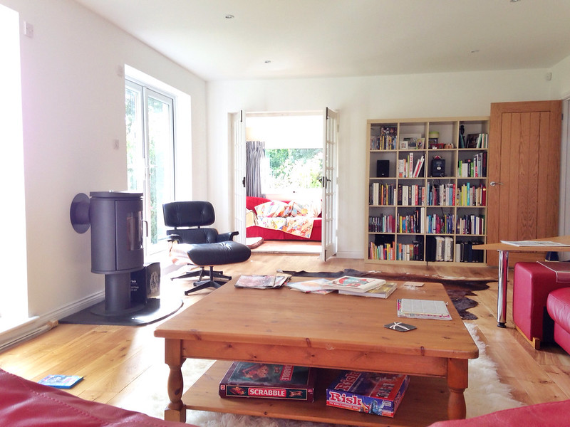
And a view down the room taken through the new sash window. Our rather collosal collection of books which we've carted round the world with us meant that we needed to have some decent storage. After considering a few options for bookcases, we eventually settled on reusing the one we had used as a room divider in the cabin. It's an Ikea Expedit which we bought second hand from eBay a few years ago.

The coffee table (which is enormous) was also an eBay purchase. The corner sofa was second hand from my parents and is 10 years-old, not that you'd know it and the red sofa you can see through the doors in the kitchen is one I bought in the Ikea bargain basement 15 years ago. We bought a new cover for it from Bemz which has completely rejuvinated it!

image

Next week we are starting the big final push to get everything sorted before our housewarming on 23rd. (I don't know about you, but I work best to deadlines!) Beyond the obvious (you may have noticed the lack of curtains and the unhung pictures) we are still undecided about how we are going to use a couple of rooms in the house. We have a spare room downstairs for guests, but also a spare bedroom upstairs. 

We debated for a while turning it into a second guest room and even went as far as looking at some beds to buy, but decided in the end that we didn't want to tie it up as a spare room when it would probably only get used twice a year. I think this has left us with a playroom downstairs and a study upstairs, but as we work our way down the to-do list I'm sure things will become more apparent!

Follow on Bloglovin

Sunday, July 27, 2014

External house photos - before and after

On Friday the final bit of external work was completed on our house and that means I can at last show you some before and after pictures of the outside.

There is still a lot to do, we have walls to paint, stairs to varnish, furniture to move, pictures to hang and our garden needs loads of work beginning with grass seed! The internal pictures will be another few weeks!

A quick recap on what we did (or rather had done!) The original house was a 1900 bungalow which had been progressively extended. We completely removed the existing roof and at the front we relocated and replaced the ground floor window on the left and replaced the one on the right. The existing UPVC front door went and in the opening we installed an oak front door.


This is how it looked in February of this year before the work started. We had originally planned to reuse the roof tiles, but stretched our budget to buy composite slate, I'm so glad we did!!


Now the side view. The first picture is of the house when we originally bought it (I think this was actually taken on completion day) in 2009. It needed immediate work on the inside and we also pushed out the middle section of the back wall to extend the kitchen.

2009...

2010...

Here's that same view today. It's hard to tie the before and after together, but the right hand window on the rendered section of the house has stayed the same throughout.


And finally the seaward facing side of the house. The room with the washing machine visible was originally a sun room with an internal window into the kitchen. We knocked through and made an arch. The two windows to the right were sitting room (middle window) and main bedroom (right) and those two rooms were knocked together to form our new living room...  

2009....

2014...

Today we have a rare cool day (I'm not complaining about the heat, honestly) so we are going to crack on with finishing as much of the inside as we can. I'll share more pictures as we progress!

Hope you are all having a great weekend...

Love Chic Living and Love Your Home


Follow on Bloglovin
Related Posts Plugin for WordPress, Blogger...